
Redesigning the client's leading sales intel tool


Seamless.AI is a SaaS for sales and marketing professionals to help them find qualified leads. They provide a real-time search engine to find accurate contact information (e.g. email, phone, social media) using the power of AI. It allows the sales and marketing professionals to build relationships with prospects quickly and efficiently.
While Seamless.AI has a great business model, they were seeking assistance in further improving their product offering. As a team of UX designers, we were entrusted by Seamless.AI to tackle the problems they are facing.

My Role
Lead Designer
(Team of 4)
Time
Jan 2019
Duration
16 Days
Opportunity
Before the first client briefing, the VP of Product from Seamless.AI gave us a list of key problems that they were looking to solve. And these were the main things from the business perspective we as a team focused on tackling:
ONBOARDING
Streamline onboarding process and increase conversion rate
STREAMLINE USER FLOW
Improve the siloed experience of finding companies vs finding people
USAGE
Optimize usage of the platform to encourage volume and usage
MOBILE EXPERIENCE
Gain more users who may favor a mobile-focused experience
In addition, Seamless.AI briefed us on their target audience, which includes sales and marketing B2B professionals. The product offers equal benefits to SMBs as it does to enterprises.
Strategy
With the client's business goals in mind, we set our strategy for this project. Being a UX Designer is not just about ensuring that users like the experience, we must balance the business goals and the user needs at the same time.
So based on the project scope, we decided that our goal was to make sure the client's product would have great:
Utility
.png)
"I need this!"
Usability
.png)
"I can use it!"
Experience
.png)
"I like using it!"
RESEARCH
With the strategy set up, we moved to the research phase. We applied various research methods to discover key insights that could improve the user experience of Seamless.AI:

Competitive Feature Analysis

User Interviews
(Existing/ Targeting)

Usability Testing
.png)
Feature Prioritization

Card Sorting
Competitive Feature Analysis
We conducted a competitive feature analysis to understand what other players in the space were doing. We used this as a guide to identifying potential areas of opportunity.
We explored and studies the platforms of key competitors such as ZoomInfo, Lusha, and hunter. And then we made a comprehensive list of key features and compared that to Seamless.AI.
As you can see from the chart on the right, Seamless.AI has most of the features among competitors in the space. At the same time, we can see there are certain features that competitors have but not Seamless.AI.
However, we must validate whether the features that other products possess are indeed necessary for our client based on discoveries from user research first.
_edited.png)
Competitive Feature Analysis Table
(Click for the full view)
User Interviews
Existing Users
We asked the client for a list of existing customers who were willing to provide feedback. We narrowed it down to 8 qualifying interviewees, who were all regular users of the platform. Because they were in various remote locations rather than NYC, such as California, Ohio, and Portugal, we conducted the interviews using video conference.
Based on the interviews with the current users, we synthesized the results and discovered a few key insights:
Key Insights from Existing Users
Users would love to see a clear identifier of which emails and phone numbers have a high accuracy rate
Users would like to add a location filter to the “People” search engine to find the right target customer group
The "Social" link was confusing for users and didn't expect it to open up the LinkedIn homepage
Users would need a better way to organize and share saved leads regarding a list of their contacts
Potential Users
For potential users who had no experience with Seamless.AI, we first sent out a screener survey to identify those who work in sales or any other role that would use a lead generation service. We then contacted those qualified and conducted interviews.
Our interviewees represent:
-
Individuals who had experience working in a Sales role
-
Individuals who worked in Sales for a range of 4-10+ years
-
Industries ranging from Banking, Media, Tech, and SaaS sales
From the interviews, we were able to gather a few interesting insights:
Key Insights from Potential Users
Users have to do a lot of research to find the right organizations to contact
Users want to know the best way to use a platform in a streamlined way
Users need to find the right and accurate contact information fast
Users have one need for mobile: check saved contacts on the go
Usability Testing
(Current product)
We conducted a round of usability testing on the current platform to understand the existing usability of the product and gather feedback from new eyes. We interviewed 5 testers, who had experience in sales or any other role that would use a lead generation service but had no experience of using Seamless.AI. We gave each of them 3 tasks to complete on Seamless.AI, and recorded their time on task, success rate to completion, and average easiness rating. The chart below summarizes the tasks and the results:

Usability Testing on Current Product (Click for the full view)
While most users were able to get through the tasks directly and went through the right path, they didn't find it easy and were frustrated by the end of the test. Here are some interesting key insights:
Key Insights from Usability Testing
?
Users felt like the onboarding process was very long, repetitive and unclear
Users were frustrated that they couldn't search for a company by its name
Users were getting frustrated by having to click twice (same button) to view content
Users had trouble navigating through various key functions
Feature Prioritization
With the unveiled key insights in mind, we identified some new features we think would be beneficial to introduce. We leveraged the MoSCoW Map method of feature prioritization to determine which features would make the most sense to introduce during this sprint to the MVP (Minimum Viable Product).
Must
Autofill Search Filters
More visible data validation
Lists of saved contacts
Tooltips
/best practices
Streamlined on-boarding tutorial
One "saved" folder for “my companies” and "my contacts"
Should
Search by Region on people page
Easier access to email (less clicks)
Display of date for data validation score
Unlimited search across filters (ie. industry, company)
Preview of contact information upfront
Could
Collaboration feature to share contacts across lists
Notification when information is updated on intel
Refresh contacts within saved contacts
More visible Intel icon near companies
Customizable file types for download
The “Must” are the features that we saw as a priority to add to our design as per our research. The “Should” and “Could” are features that we also added but would recommend as time and resources permit.
Card Sorting
From the user interviews and usability testing, we found out that there was a user need for new and more organized information architecture.
Thus, we proposed a design change and used the card sorting research methodology to validate it and see how users organized content on the website.
We found that the majority of users were able to replicate what we intended, which helped to solidify our designs.
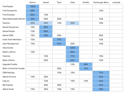
Card Sorting Result (Click for the full view)
Persona
Just to recap, our client's target audience is sales and marketing B2B professionals. Now with all the research conducted, we made a persona as a guide to ensure we were designing for the right user. This persona highlights the needs, pain points, and goals of our target user backed by the key insights from our research.
Meet: Craig
Age: 29
Location: New York, NY

Title: Account Executive
Craig loves his fast-paced role in B2B Sales at a SaaS company in NYC. He has been in his role for a few years and he loves working with his team collaboratively. He is now trying to expand his network as well as his client list.
Needs
-
Finding contact information for potential prospect
-
Understanding and identifying new organizations to do business with
-
Collaborate with his team/manager when finding prospects
Pain Points
-
Getting the runaround when trying to connect with a potential lead
-
Not having accurate data when trying to contact a lead
-
Lack of transparency when it comes to prospecting with his team
Ideation
With the research insights and our persona in mind, we conducted a Design Studio to identify how we wanted to implement these changes. We brainstormed and quickly generated concepts, flows, and features to be integrated into the MVP.


Sketches during Design Studio
DESIGN
Seamless.AI "Redesigned"
Now I present to you: Seamless.AI redesigned. The newly designed platform addresses the users' pain points and needs while still balancing the business goals and the existing product's structure to make sure it is implementable by the client.
Research >> Design
Here shows how we translated the key insights uncovered from our research into the specific design changes.
Insight: Users want to see a clear identifier showing how accurate those emails and phone numbers are
Insight: Users need to find the right and accurate contact information fast
1
Design: A color coded grading system that shows AI validated accuracy scores of the specific contact info

Insight: Users were getting frustrated by having to do a lot of unnecessary clicking (same button)
2
Design: Replaced “Find” and “View” button with one single-clicked “Add” to streamline experience

3
Insight: Users would need a better way to organize and share saved leads
Insight: Users have one need for mobile: check saved contacts on the go
Design: Added “My List” functionality so users can better manage saved leads


4
Insight: Users felt like the onboarding process was very long, repetitive and unclear
Insight: Users want to know the best way to use a platform in a streamlined way
Design: A streamlined onboarding tutorial with added tooltips and highlighted key info
?


5
Insight: Users had trouble navigating through various key functions
Insight: Users would need a better way to organize and share saved leads
Design: A more intuitive top navigation bar with the new "Team" functionality added

Validated by Card Sorting
Insight: Users were frustrated that they couldn't search for a company by its name
6
Design: Allowed users to search by company name which was much needed

Insight: Users would like to search for people by location to find the right target group
7
Design: Added “Location” filter on “Find People” page to meet users' demands

Outcome
So how is the performance of the redesigned product compared to the existing one?
As you can see from the chart below which summarizes the results from the latest round of usability testing, all performances have been drastically improved across the board.

Usability Testing on Redesigned Product (Click for the full view)
From the chart above, we can see that the average time to complete each task has been vastly reduced. For example, we saw:
-
Over 3 minutes time-saving for the on-boarding process (Task 1)
-
Over 2 minutes time-reduction for adding an organization (Task 2)
-
The success rates and easiness ratings have all been increased across the board
In addition, we discovered that users really liked the streamlined tutorial, but they needed some more directions on which tool tip to see first. As a result, we added numbering to each tooltip as a way of direction. The change has been reflected in the final prototype.
To summarize, the final prototype we delivered to the client was able to solve the issues provided by the client as well as synthesized from user research. We successfully improved the following within the opportunity space:
ONBOARDING
Onboarding process has been vastly streamlined and has received positive user feedback
STREAMLINE USER FLOW
The experience of finding companies and finding people was improved with new features
USAGE
Added new features discovered from research that are needed to encouraging more usage
MOBILE EXPERIENCE
Successfully identified mobile use case and designed the prototype for a better mobile experience
Where do we go from here?
Recommendations
-
Prioritize updated onboarding, navigation changes and combining company and people searches
-
Consider building out the collaboration feature to share lists
-
Color coded data validation on search results
Next Steps
-
Additional round of usability testing on final designs
-
Usability testing on responsive mobile design
-
Handoff design files and deliverables to Seamless.AI