New York State
Board of Elections
A Government Website
Architecture Redesign


The New York State Board of Elections was established in the Executive Department in 1974 as a bipartisan agency vested with the responsibility for administration and enforcement of all laws relating to elections in New York State.
In addition to the regulatory and enforcement responsibilities, the board is charged with the preservation of citizen confidence in the democratic process and enhancement in voter participation in elections.


With politics being an important topic in the United States today, it is important to inspire and help fellow Americans to exercise their civic rights. New York State Board of Elections has the opportunity to better fulfill their responsibility by improving the currently outdated site. If the user pain points are identified and fixed, this site could become a valuable resource for potential and current voters. (This is a conceptual design. I'm not affiliated with NYS BOE in any form.)
Given this meaningful opportunity, I partnered with two other UX designer Nancy and Priya during the research phase to uncover key insights and explore potential enhancements. And after that for the design phase, I worked as a solo designer to complete the wireframes and the prototype.
My Role
UX Researcher (Team of 3)
UX Designer (Solo)
Time
Dec 2018
Duration
2 weeks
Archetype
The archetype of the users would be the New York State voters, especially those who are new to NY. Their needs include: (1) register to vote in the upcoming election; (2) see current elected officials; and (3) look up where and how to cast a vote, etc.
As you can see from the graph below, the organizational goals of NYS Board of Elections (BOE) and the user needs are very much aligned together. For us UX designers, our goal is to reach the optimized area that covers both.
Organizational goals
User needs
Preserving citizen confidence in the democratic process and enhancing voter participation
Register to vote in the election, see current elected officials, and look up where and how to cast a vote

Hypothesis
Below are some screenshots of the current NYS BOE website. (As of Feb 2019)


As you see, the website is cluttered. So as our hypothesis, we assume people may feel the current website is time-consuming and frustrating to find key election information.
RESEARCH
We conducted research using various methods which gave us detailed insight into what is working for the existing product and what is not. They also help us identify where the main friction points are and what can be done. The research methods included:

Screener Survey

Heuristic Evaluation

Usability Testing

Card Sorting

Competitive Matrix

Site Mapping

Feature Analysis

User Flow
Screener Survey
As our first step, we conducted a screener survey to identify potential users who were eligible to vote in the US and would want to register to vote in New York.
For one of the questions, we asked how our users registered to vote. 25% of our surveyors state that they registered through a website while 50% registered through the DMV.
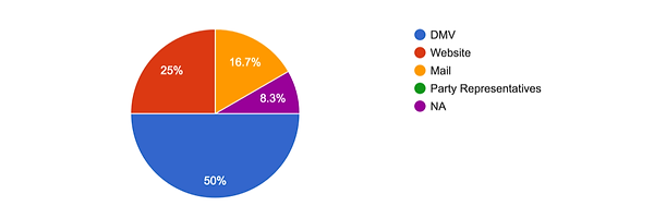
The screener survey not only gave us insight into which users we could conduct usability tests on, but also gave us insight into the most popular way to register to vote. From the screener survey, we chose 5 people to usability test the existing product on.
Usability Testing
(Existing Website)
With the 5 qualified users identified, we conducted a usability testing on the current NYS BOE website. We gave each of them 4 different tasks to complete and ask a few questions to identify pain points, frictions, and areas of improvements. The chart below summarizes the result.

From the usability testing, we uncovered a few key insights:
1
3 out of 5 testers failed to find the polling location because the link was not intuitive at all.
Users have to go through 4 different pages and fill out 2 forms to find the information.

2
The large clutter of text and links made it overwhelmingly indigestible.
"There’s a lot going on and there’s no visual hierarchy to guide me."
Quote from a user
3
The lot of PDFs and Excels uploads were confusing and frustrating to users.

4
Users wanted a link provided for them to register to vote online at DMV.

Competitive Matrix
We then did a competitive matrix in order to see the similarities and differences in the industry. We first identified a few sites with similar business models, and then placed them on the matrix.

Through the competitive matrix, we were able to confirm some key insights:
-
Online voter registration often links to the local DMV website
Confirms Insight #
4
-
A lot of other voting sites were less wordy or cluttered
Confirms Insight #
2
Feature Analysis
(Competitors and Comparators)
The feature analysis of competitors and comparators help us identify standard features and existing practices and how others approach solving the common problems. The chart (left) shows how NYS BOE website's features compare to the direct competitors, and the chart (right) shows comparators.
Competitive Feature Analysis

Comparative Feature Analysis

Through the competitive and comparative feature analyses, we were able to confirm some key insights:
-
Online voter registration often links to the local DMV website
Confirms Insight #
4
-
Other voting sites have intuitive links for polling locations
Confirms Insight #
1
Heuristic Evaluation
With this research method, we worked together and evaluated the site based on Abby Covert’s Information Architecture Heuristics, which looks at a site’s findability, accessibility, clarity, communication, usefulness, credibility, controllability, value, learnability, and delightfulness.
We judged five pages by this standard, including the homepage, the voting information, the elected officials and district map page, the “where to vote” page, and the election results page.
The screenshot below shows a partial heuristic evaluation. You can see the analysis here.

Figure: Screenshot of the heuristic evaluation (part)
Through the heuristic evaluation, we were able to confirm some key insights:
-
The site lacks visual hierarchy and has an abundance of verbiage
Confirms Insight #
2
-
The lot of PDFs files create accessibility issues
Confirms Insight #
3
Card Sorting
We collected a representative list of 39 content items and wrote each one on a single card. And then we conducted 1 open card sorting and 1 closed card sorting, each with 5 participants in order to understand how users and the BOE organize information.


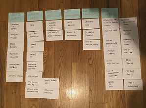
Through the card sorting, we were able to discover a new key insight:
-
There were a few items that participants all sorted into different categories, which could potentially be overlapping.
Insight #
5
DESIGN
How might we help voters in New York State register to vote, find key election information, and head to the polls?
Solution
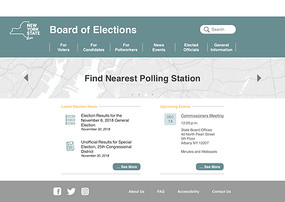
The solution is a redesigned website for NYS Board of Elections. It is a less clustered, quick, and simple-designed solution that helps people register to vote, find key information, and participate in elections.
Research >> Design
Let me show you how I translated the research insights into specific design solutions.
1
The link for finding polling location was not intuitive at all and very hard to find
Added “Where to Vote” under “For Voters” and also as a banner on the home page


2
The large cluster of text and links made it overwhelmingly indigestible to users
Eliminated redundant verbiage and simplified the overall design and navigation


Validated by Card Sorting
3
The PDF and Excel uploads for the latest information were frustrating to users.
Replaced with webpage links and cleaned up home page layout design

4
Users wanted a link to register to vote online at DMV website
Added an online voter registration link under the tertiary navigation item “Register to Vote”

5
There are items that could be in multiple categories
Added a “See also…” section for those overlapping and related items

Result
To evaluate the performance of the revised website (prototype), I conducted a round of usability testing and analyzed the before-and-after user flows and site maps to see the improvements.
Usability Testing
(Redesigned Website)
The chart below summarizes the result from the usability testing on the redesigned website.

As you can see, the performances have been improved drastically across the board. People no longer have trouble finding polling locations and navigating items, and the average time to complete a task are all reduced.
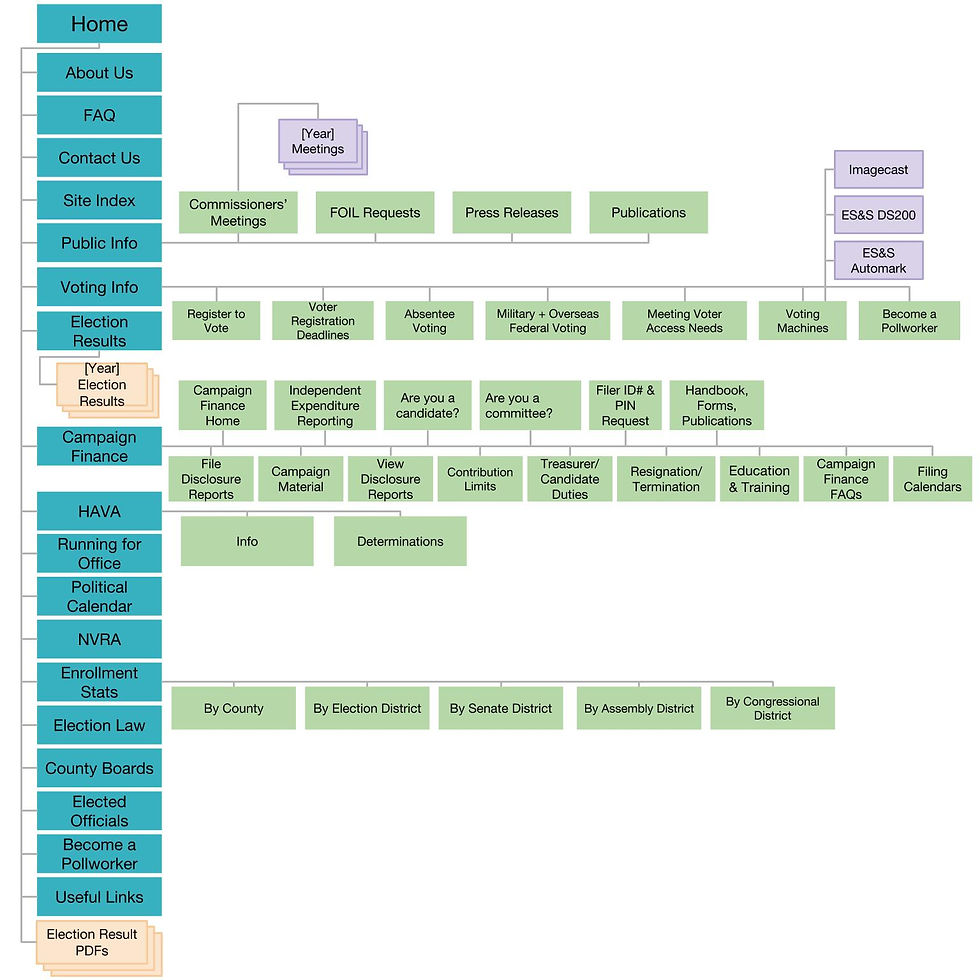
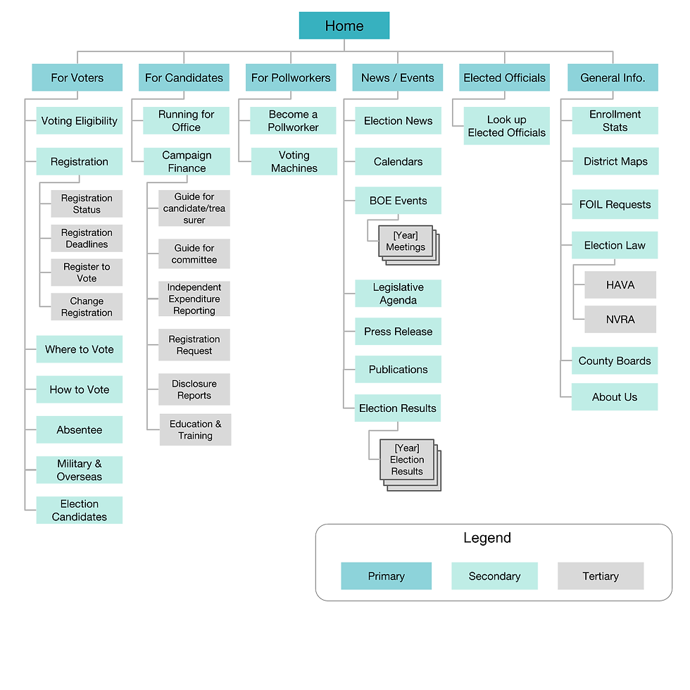
Site Map
(before and after)
User Flow
(before and after)


Design Process
So how did I make the prototype above?
The process started with mid-fidelity wireframes after ideating the design solutions based on research findings.
Then, I conducted a round of usability testing on the mid-fi prototype and make improvements before moving it up to high-fidelity.
.png)
.png)
.png)
.png)
.png)
.png)
.png)
Next Steps
-
Completed the final design for other webpages from the site
-
Conduct another round of usability testing for new pages
-
Get stakeholders’ approval and started project planning with other designers and developers